Package Design
This collection showcases my work in package design, with a focus on combining illustration, storytelling, and structural layout to bring humorous and unconventional concepts to life. Each project challenged me to develop a unique visual identity while exploring different methods of production; from analog text distortion to various hand-drawn assets. These designs reflect my interest in playful branding, nostalgic inspiration, and creating tactile, and visually engaging experiences.
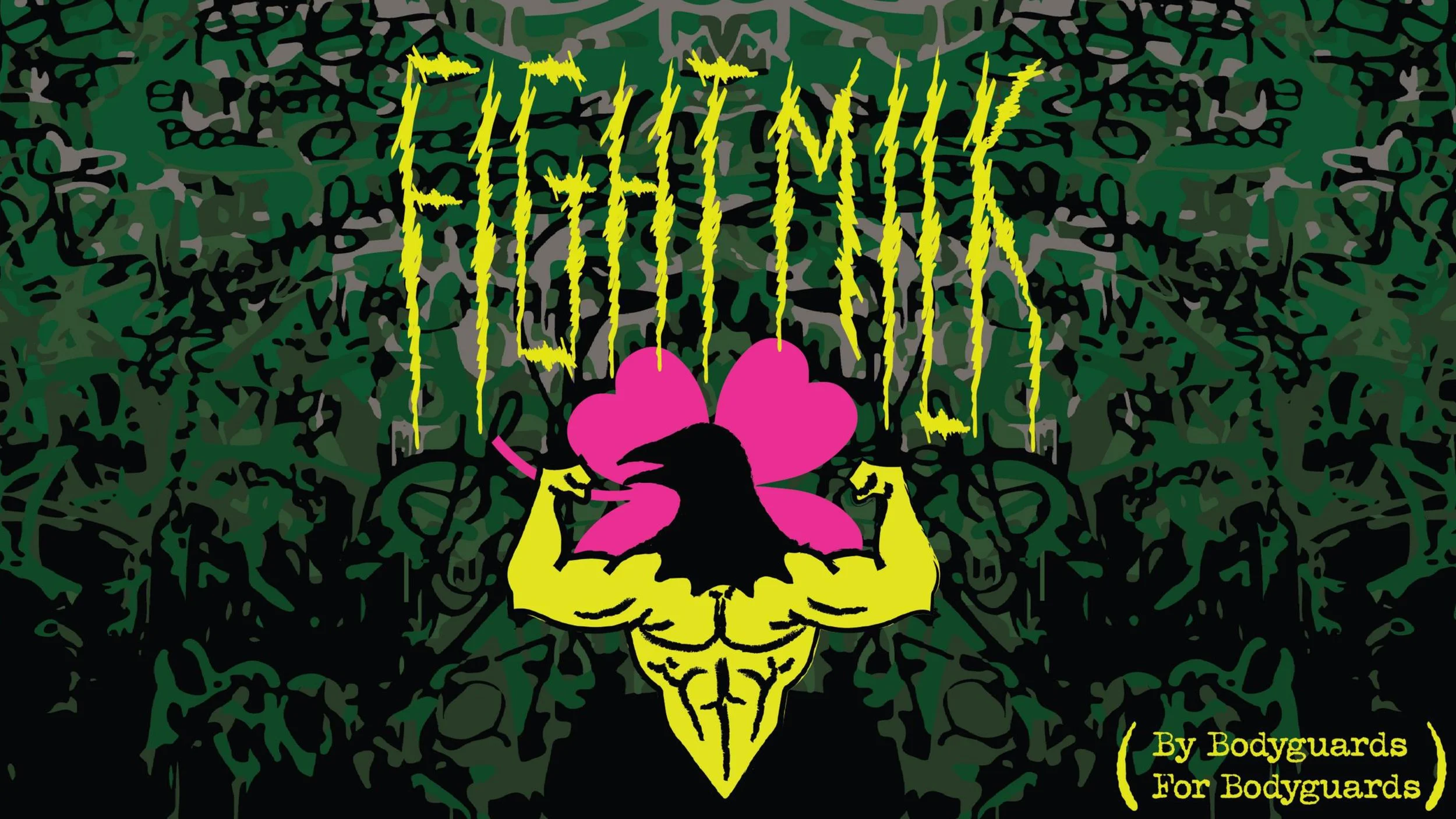
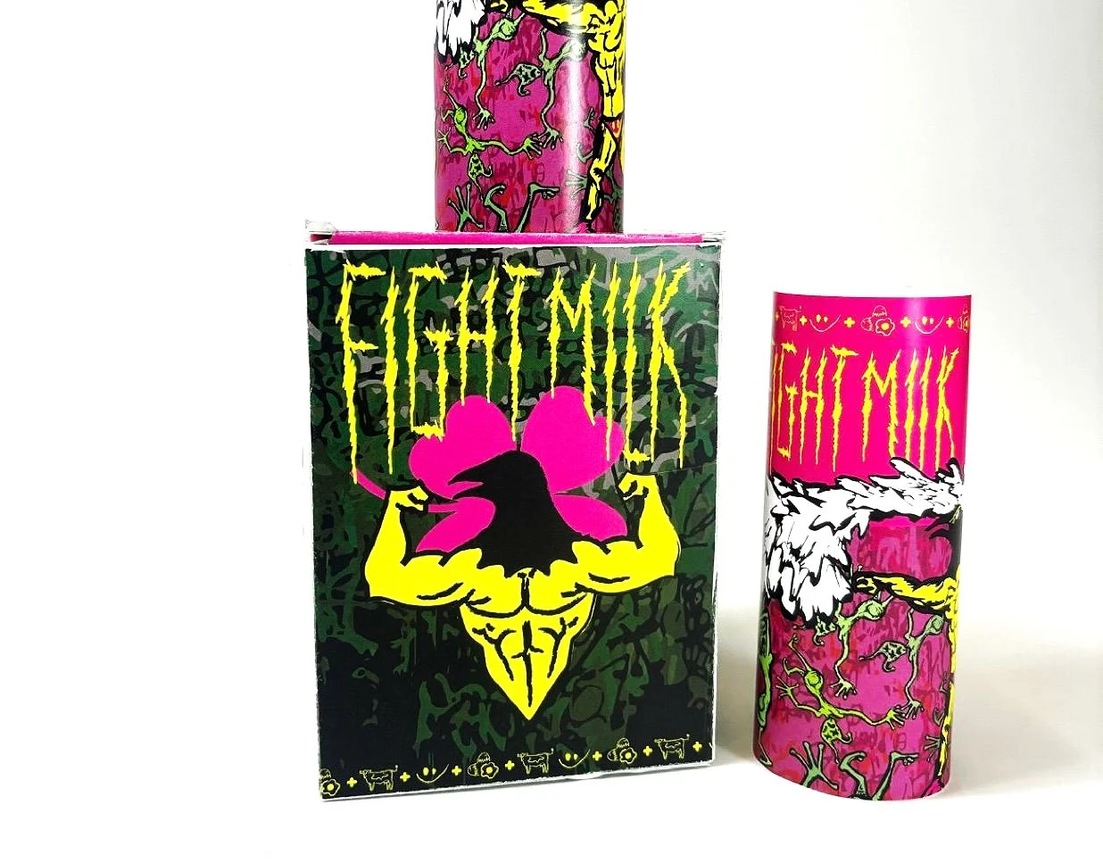
Fight Milk
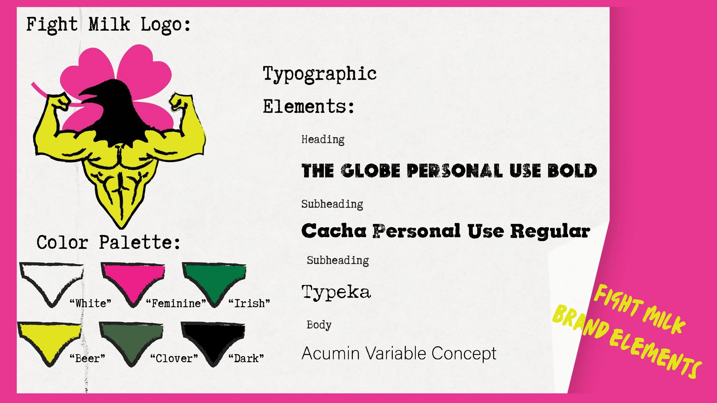
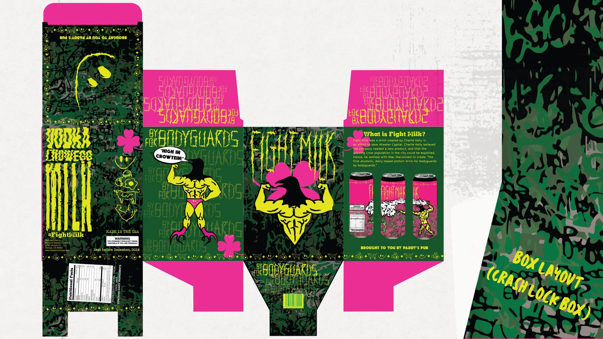
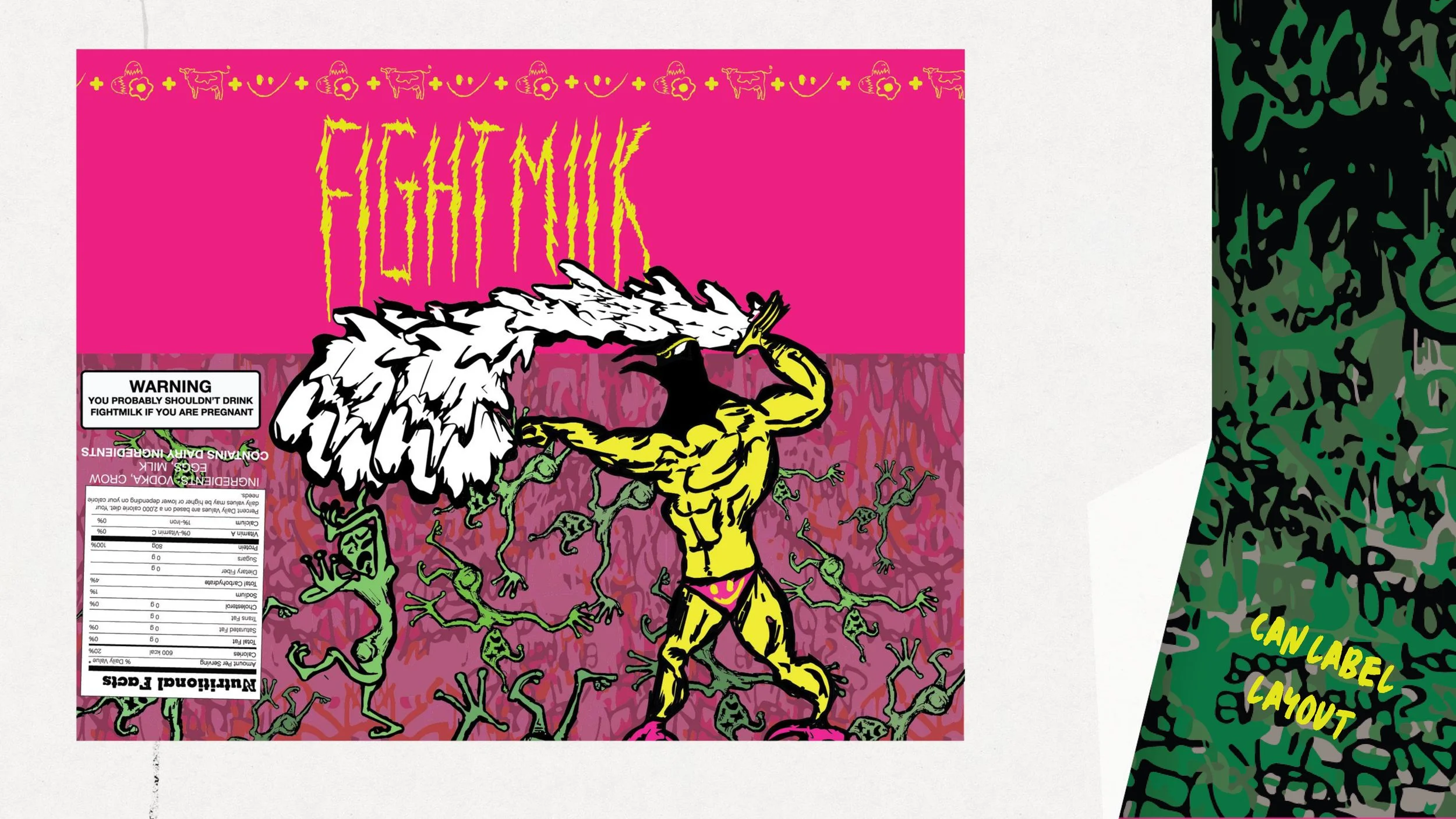
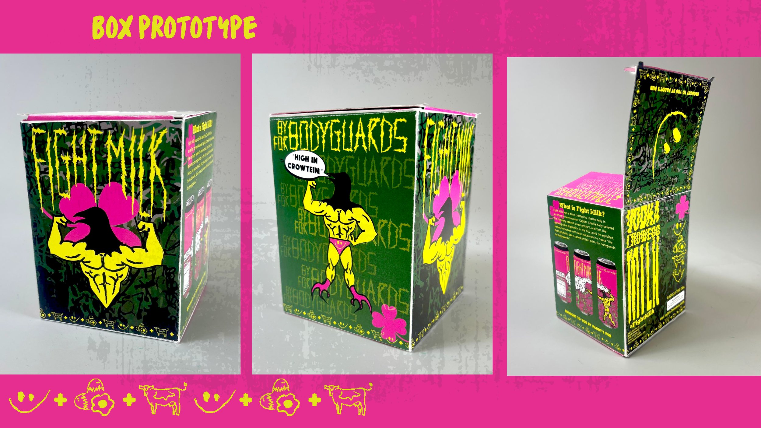
As part of a rebranding challenge, I reimagined Fight Milk, the fictional beverage from It’s Always Sunny in Philadelphia, as a real-world product. I illustrated all graphic elements by hand to align with the show’s chaotic and immature humor, capturing the over the top energy of the source material. To reinforce the gritty, unrefined aesthetic, I used analog techniques to manipulate typography, scanning, printing, and physically altering text before re-digitizing it. The final packaging was built on a snap lock box layout, giving the project a clean yet functional structure for physical mockup and presentation.
Package Presentation
These designs were put together and edited in Adobe Illustrator, and below is a presentation of the product.


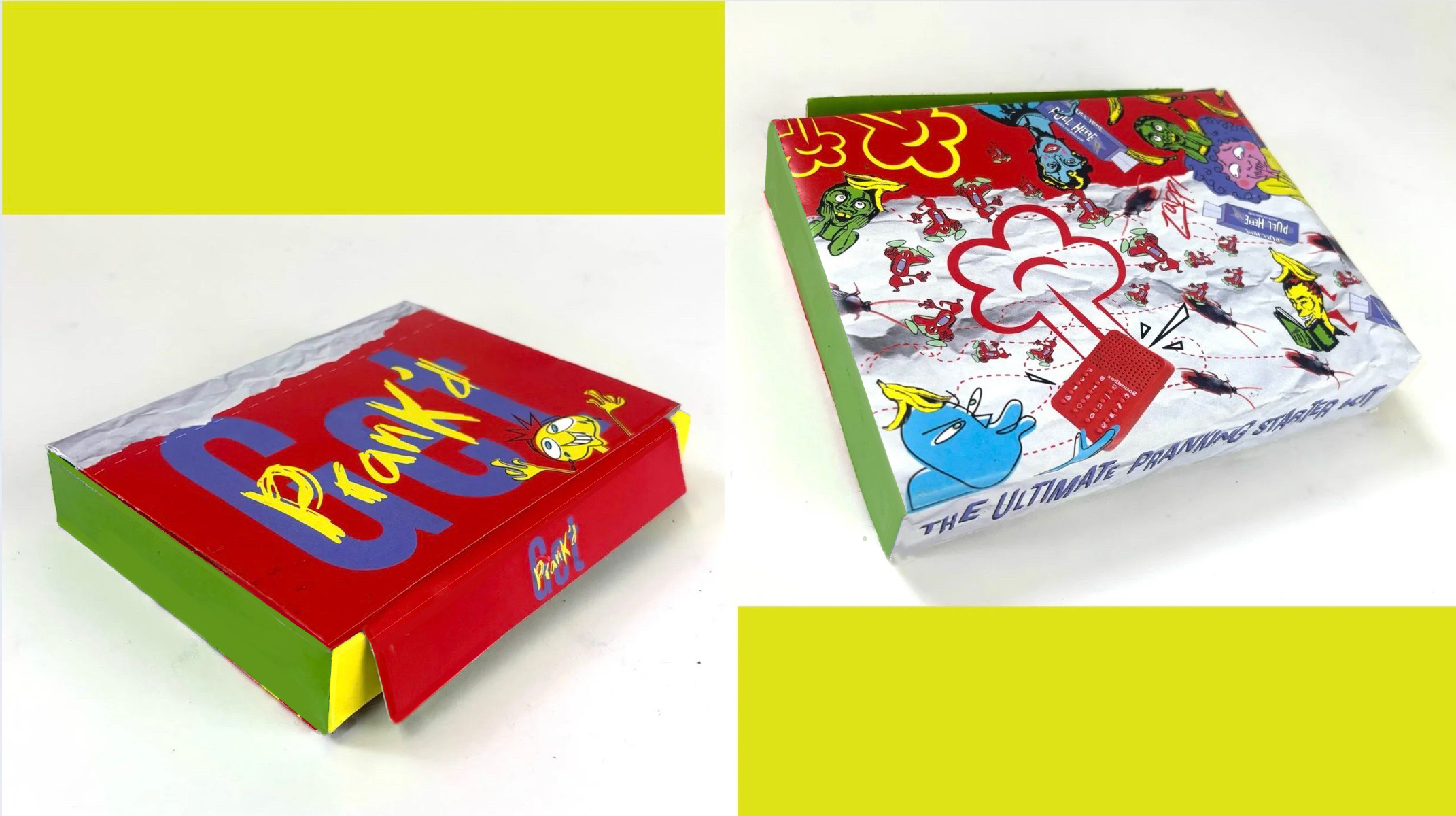
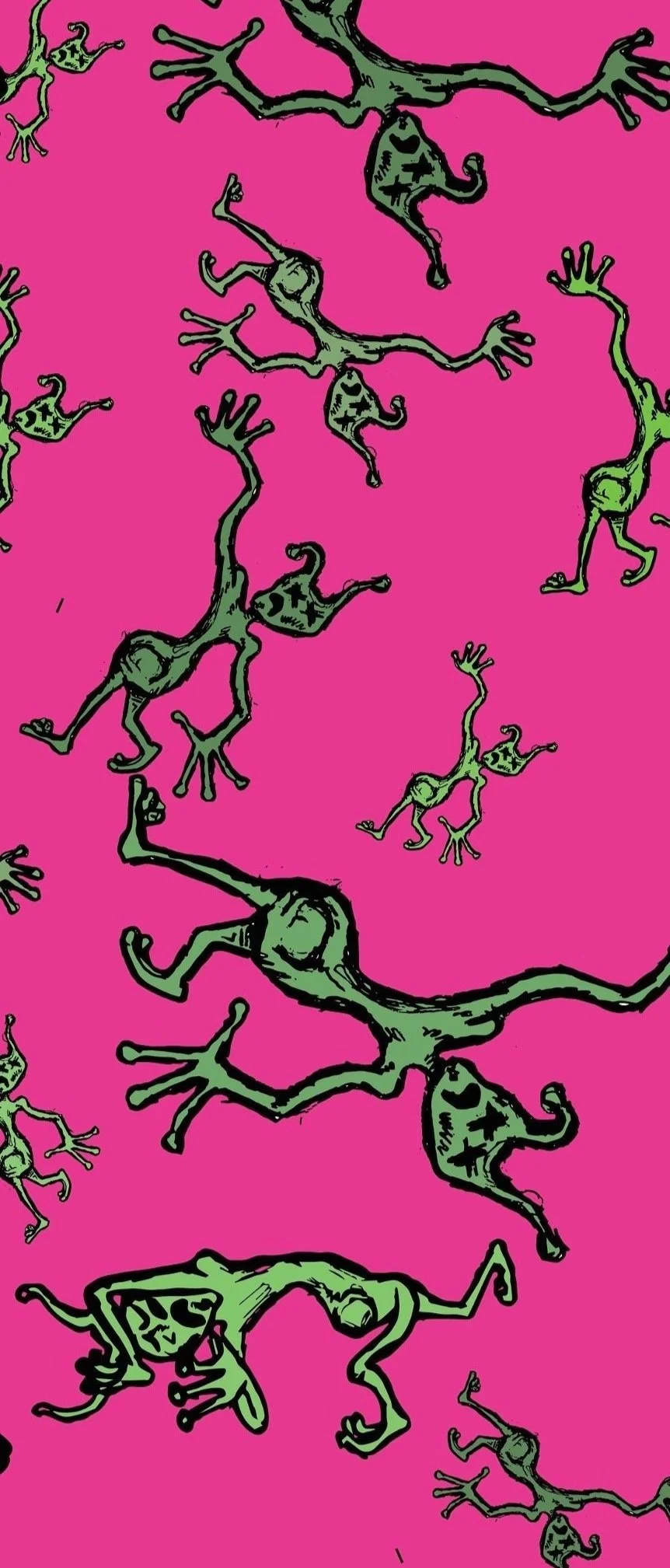
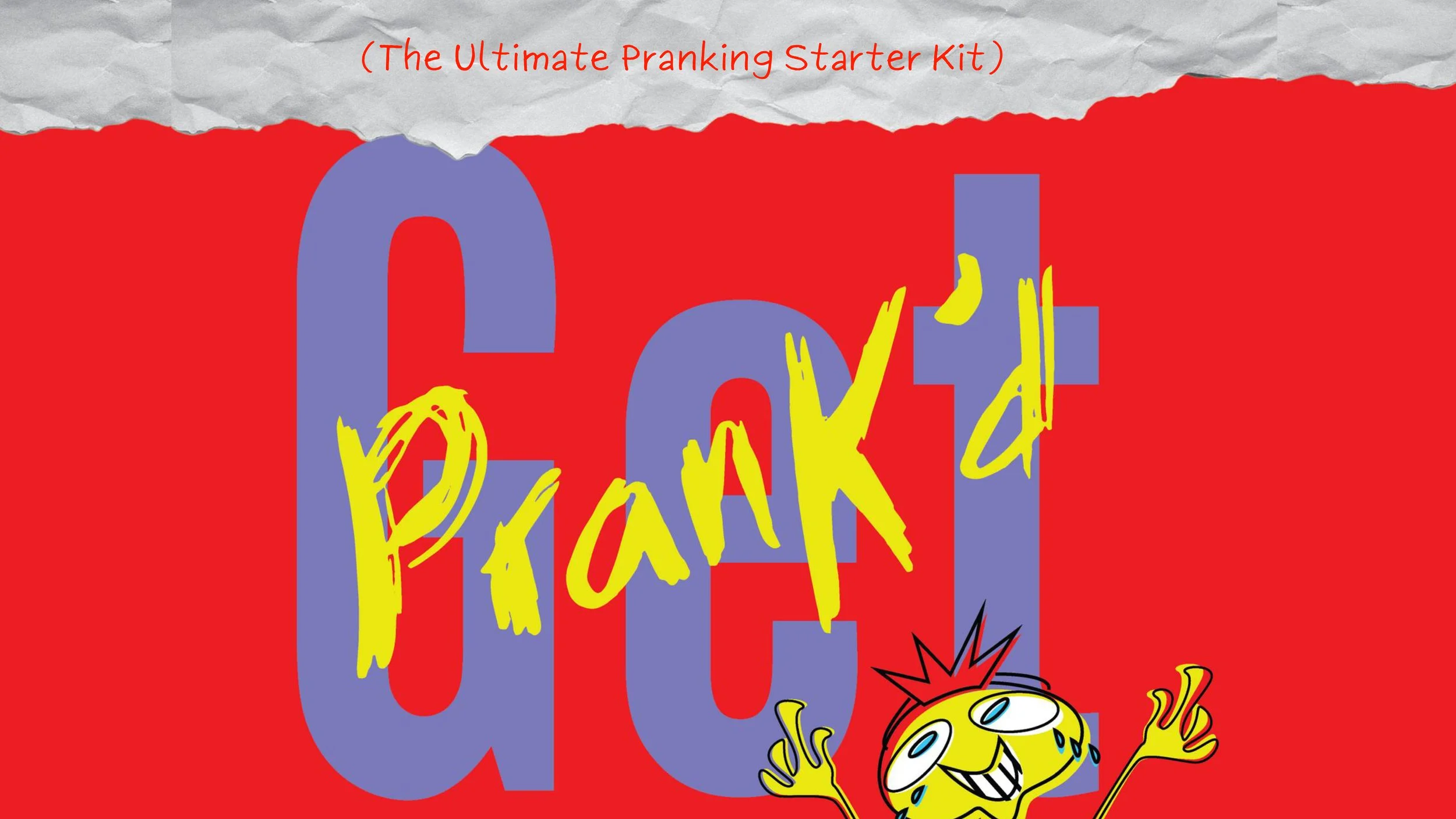
Get Prank’d: Prank Kit
This prank kit was a fully self-imagined and designed product, created from the ground up, including concept, branding, illustration, and structural packaging. Inspired by vintage toy advertisements from the 1990s, I aimed to capture the loud, chaotic energy of that era through hand-drawn illustrations, exaggerated typography, and a vibrant, nostalgic color palette. The goal was to evoke a playful, over-the-top feel that mirrored the prank-themed contents of the kit. I designed the layout and structure of the box myself, to bring the concept to life as a tangible, mock retail product. The final result is a fun, eclectic design that blends childhood nostalgia with bold, contemporary humor.
Creating a Design System
Cover
Mood Board


Hand-Built Prototype